tiktok.com: The Good, Bad, and Hilarious

TikTok is a social media platform where users can create and share short videos with a focus on music, dance, and comedy.

Let’s talk fonts. The first thing that jumps out at you on TikTok’s website is their bold and playful choice of fonts. The typography certainly matches the fun and energetic vibe of the platform. However, the use of multiple fonts can sometimes feel a bit overwhelming and chaotic, like a teenager’s messy bedroom.
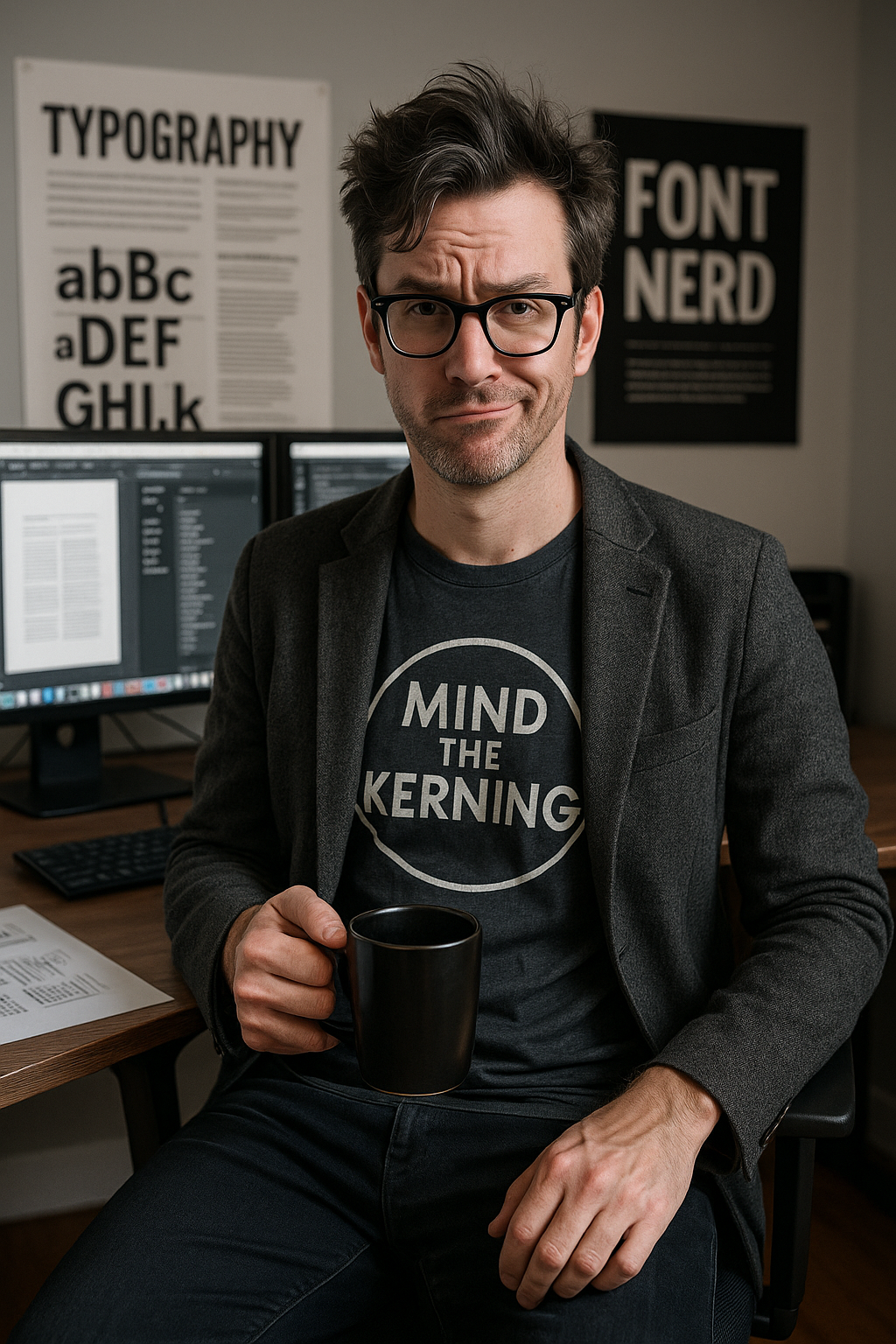
"With all these fonts, it's like the website is trying to start a dance-off between Times New Roman and Comic Sans."

Moving onto the user experience and interface design. TikTok does a great job of keeping things simple and intuitive. The layout is clean and easy to navigate, making it a breeze for users to find and create content. The use of bright colors and engaging visuals also adds to the overall user experience, drawing you in like a catchy TikTok tune.

"Using TikTok is like scrolling through a never-ending collection of bite-sized entertainment, kind of like a bag of chips you can't stop snacking on."

However, one area for improvement is the website’s responsiveness on different devices. While the mobile experience is seamless, the desktop version could use some optimization to ensure a consistent and enjoyable user experience across all platforms. After all, you wouldn’t want your audience missing out on all the TikTok dance challenges because of a wonky website layout.

Overall, TikTok’s website shines with its vibrant fonts and user-friendly interface, capturing the essence of its platform. With a few tweaks here and there, they could elevate the user experience even further and keep users coming back for more viral videos and endless scrolling.

This critique won’t share itself.
Be a hero, not a pixel hoarder.
Share the article!
Kernelius Boldface

Kernelius Boldface

When Kernelius critiques a website, pixels spontaneously self-correct out of sheer panic. It's said Google changed its logo to avoid his wrath.